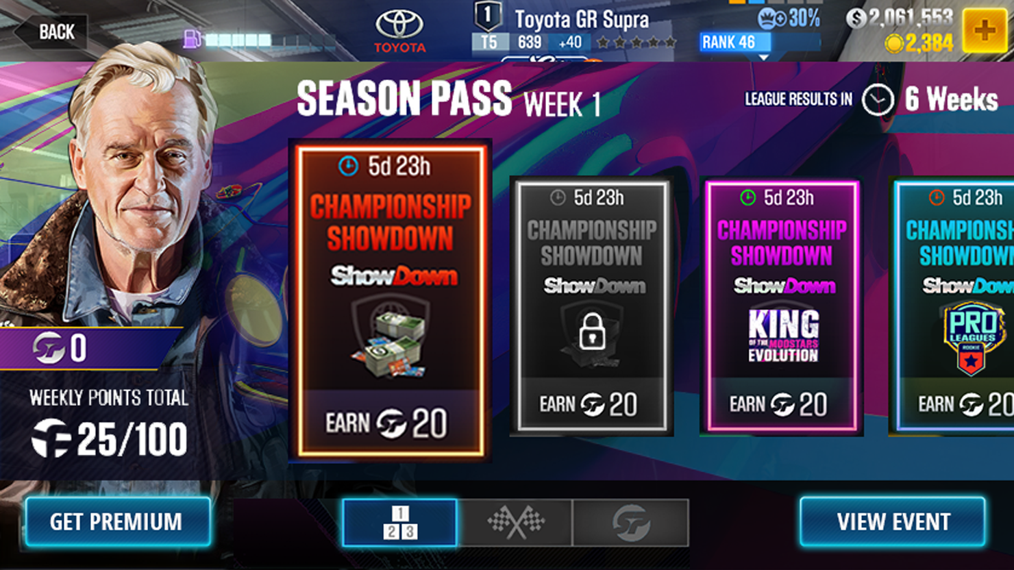
CSR2 is a driving simulator mobile game designed around collection mechanic of hyper-realistic in-game cars. Players can compete against one another or engage in a story mode.
A "Battle Pass" is a tool used in Game Design to generate/rejuvenate players' interest in the game by giving access to new and exclusive content upon purchase of the pass.
As a disclaimer, all information displayed here is the property of Zynga/CSR2, and I am in no way taking ownership or trying to sell the same.
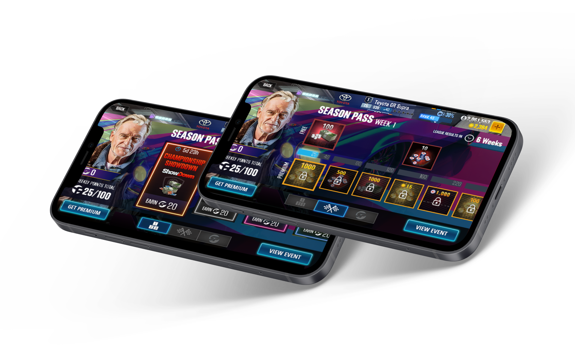
Data showed a decline in player engagement due to various factors. The team needed to come together and develop a solution to tackle these problems.
Data showed a decline in engagement due to inability to progress as the major culprit. Players were "hardstuck" (firmly stuck in a rank or elo) because the earning of progress points was disproportionate to the amount of effort required. Meaning, too much grind needed to move forward in the game.
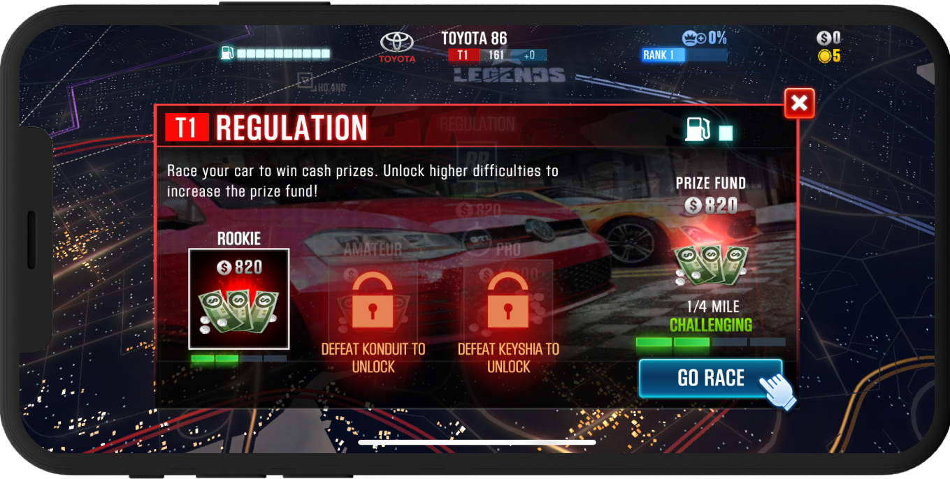
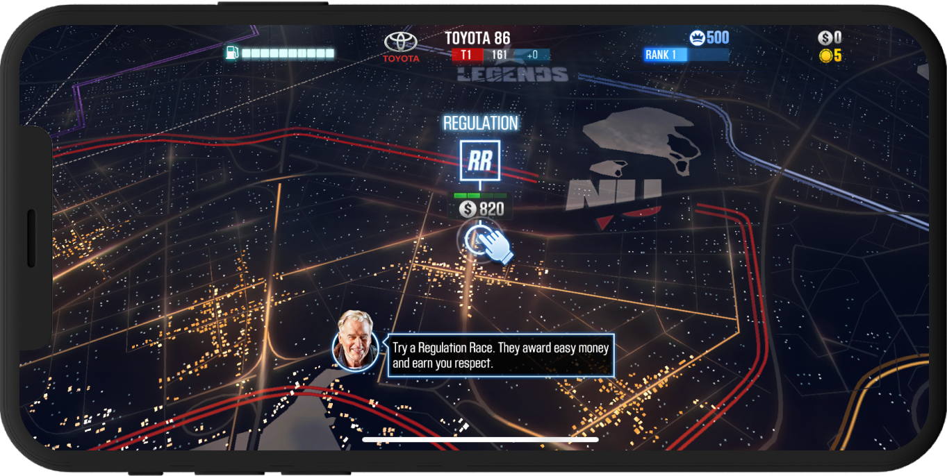
Another reason why players stopped playing was the unclear path to move forward. If one's familiar with CSR2, they'd know the map page is too cluttered and confusing. This page is the jumping off point for the game with all the races on the map and the players get to choose which race to participate in.
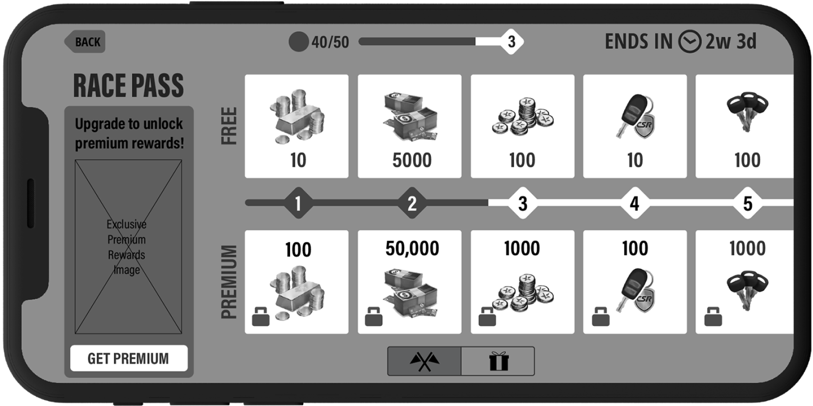
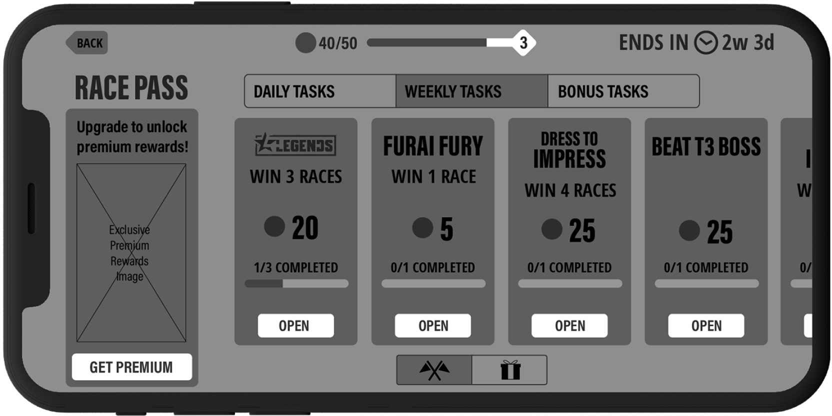
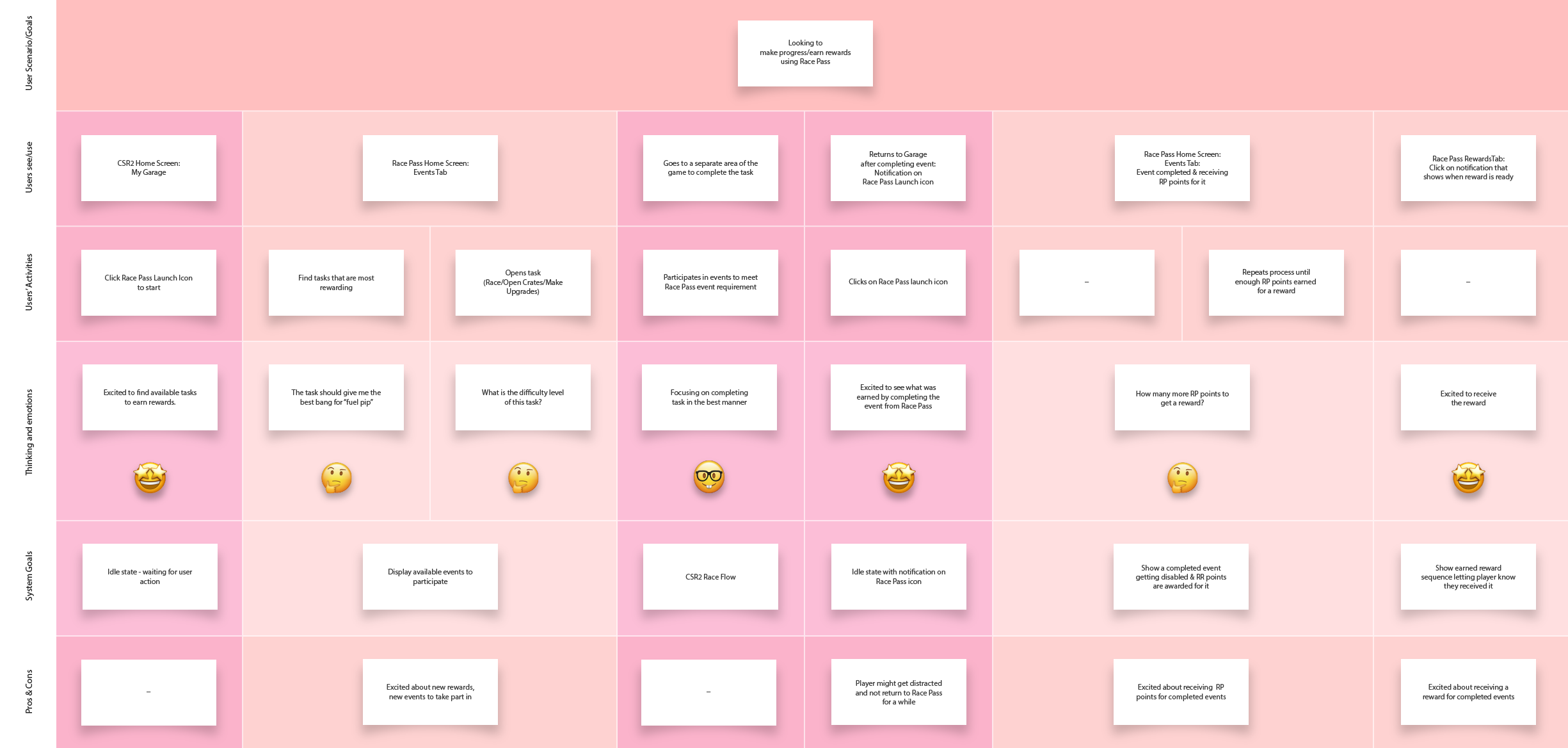
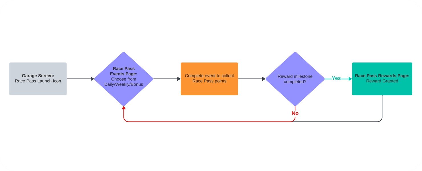
The team created Race Pass to mitigate engagement drop-off in features by tying them in together and offering players to earn progress points and other rewards for participating in them. After collaborating with stakeholders, and initial research, the main tasks for me as an Experience Designer were boiled down to what's below:
One of the most important part of designing a feature that players will enjoy, is to create a meaningful connection between the task to be completed and the rewards associated with it. Visually representing this connection was going to be the biggest challenge.
CSR2 was first released in June 2016, with over 140 million downloads. Any new feature needs to fit into the existing game seamlessly without causing too much friction for existing players.
Designing the feature so the players enjoy the time being spent in the game was crucial. Players needed to clearly see and understand the value they got from playing this new feature, which will motivate them to stick around and continue playing.
After extensive research, iterative design and testing, I was able to arrive at a solution.
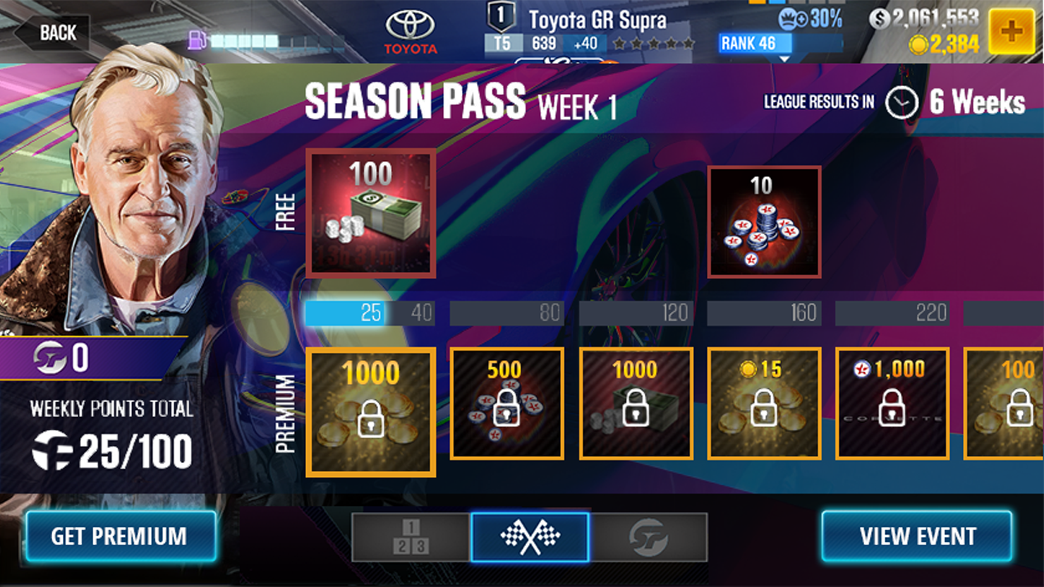
Battle Pass is a feature that most players are familiar with from other games they play. I used a similar user pattern to help them quickly comprehend how to use the new feature.
CSR2 Battle Pass was designed using existing components from other parts of the game to reduce cognitive load, increase familiarity, and reduce learning and confusion.
When users understood the value they received from Battle Pass, they would be motivated to continue engaging and make purchases to keep moving forward in the game.
"Amith worked as the Lead UX Designer for over a year at Zynga Inc. while I was the Senior Producer for the team, before I moved on. During this time, I have been impressed with the attributes he displayed such as his persistence, diligence and commitment to work. Owing to Amith's attention to detail, we have never had cause for concern in terms of the quality of his output. He has always been enthusiastic about his work and does not leave a single stone unturned when presented with a challenge.
Amith is very cooperative and aligns himself with the team to ensure its collective success. He showed good leadership qualities when he identified opportunities for improvement in the process followed on his own initiative and worked with his team members to increase efficiency."