Redesigned User Experience
for Easy Expunctions

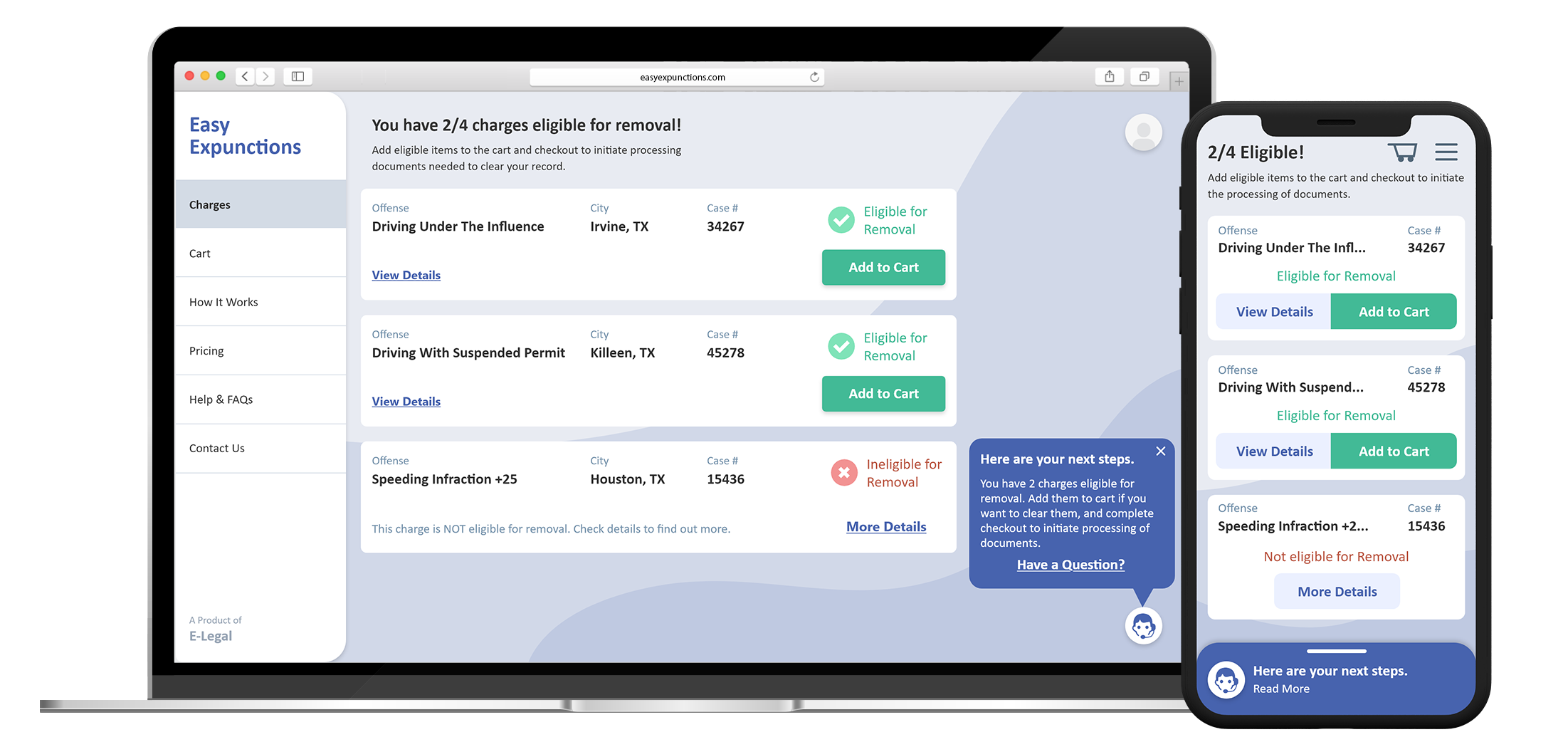
Records Dashboard provides users with access to their criminal record, and enables them to clean up eligible charges from their public record.

To stay concise here, below are some key highlights from the project. If you would like to discuss this project in detail, kindly reach out to me.
...
Page Dog Ear

Situation

This application enables the user to legally conceal eligible criminal charges from the user's public record. For the user, this opens up opportunities that were out of reach like higher education, financing, civil rights, etc.

About the User Experience

Currently, when users needed to take action on their record, due to lack of a clear path forward, they requested instructions over the phone from our help desk. This costed valuable resources from the team, and caused frustration among users.

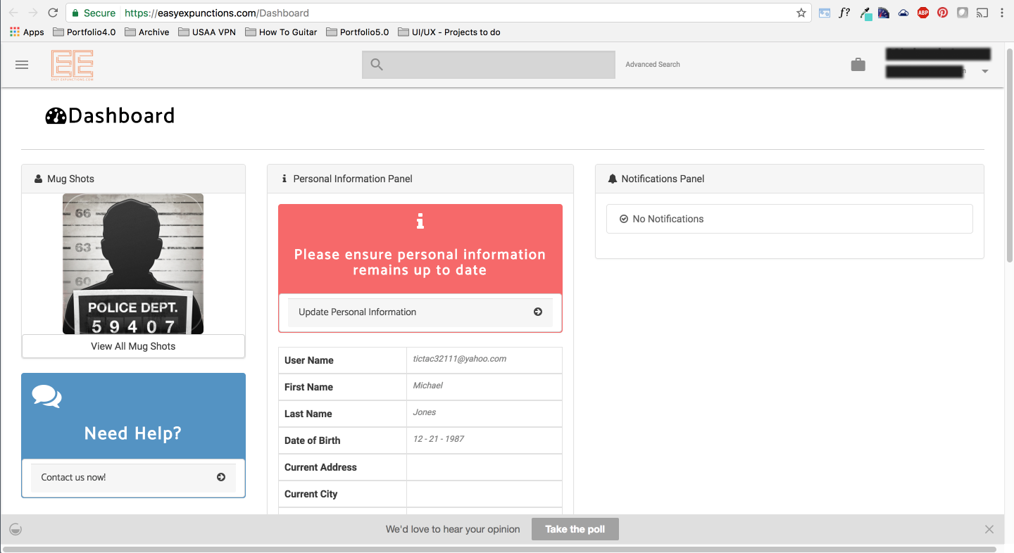
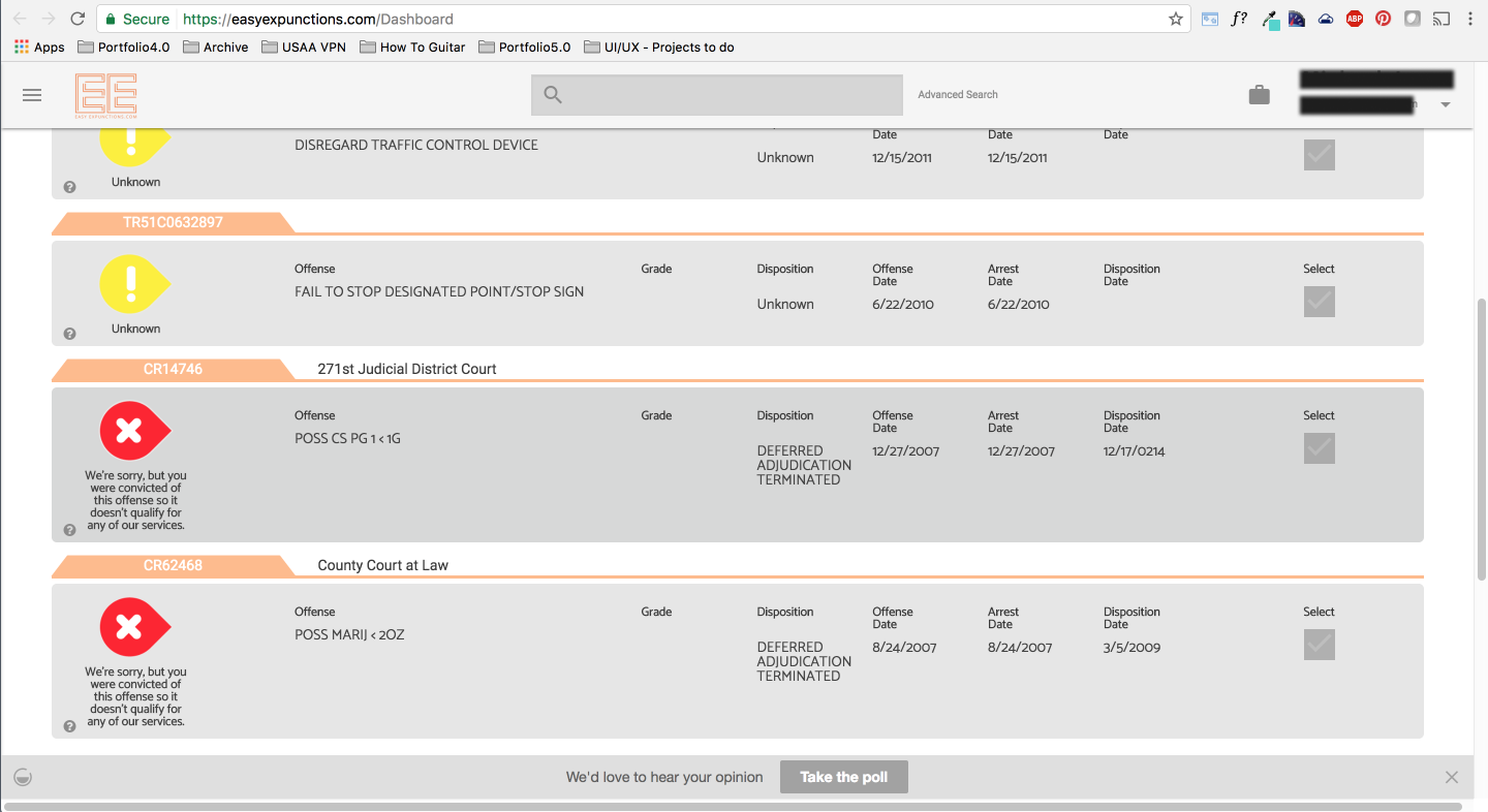
The application runs on the users' device browser. Data showed majority users accessing from their mobile devices. The existing solution did not resize appropriately for smaller screens, which resulted in a choppy and unsatisfactory user experience.

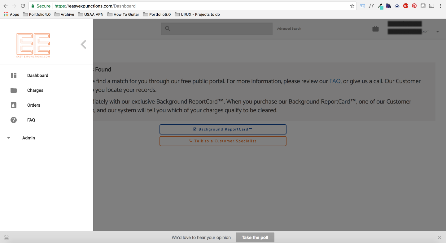
Screenshots from existing design of Records Dashboard.

Page Dog Ear

Task

By analyzing the existing solution, feedback from users, and collaborating with stakeholders, the major tasks were boiled down to what's below:

Priority #1

Inefficient Checkout Process

The current checkout process presented a lot of friction, causing frustration and untrustworthiness among users, leading to incomplete and abandoned checkout flow.

Priority #2

Outdated/Absent UX Principles

Users felt lost and stranded in an unstructured environment with poor usability standards, information hierarchy, and guidance about where to go next.

Priority #3

Untrustworthy Interface Design

The user interface design emanated a cold, and unwelcoming tone. The website felt dated and untrustworthy to be handling users' sensitive information.

Page Dog Ear

Results Achieved

Focus Group & User Interview

I conducted user interviews to gather insights and validate hypothesis about the current state and future state of the dashboard. Information gathered here drove important design decisions for the application.

Incremental Exposure & Dashboard Assistant

As part of the efforts to reduce cognitive load for users, elements on the page were introduced to users like a tutorial. A dashboard assistant was also incorporated that would guide users on what they need to do next in the process.

2000% Increase in Purchase Rates

After implementing the proposed solution, data showed a 2000% increase in purchase rates from users on Records Dashboard.

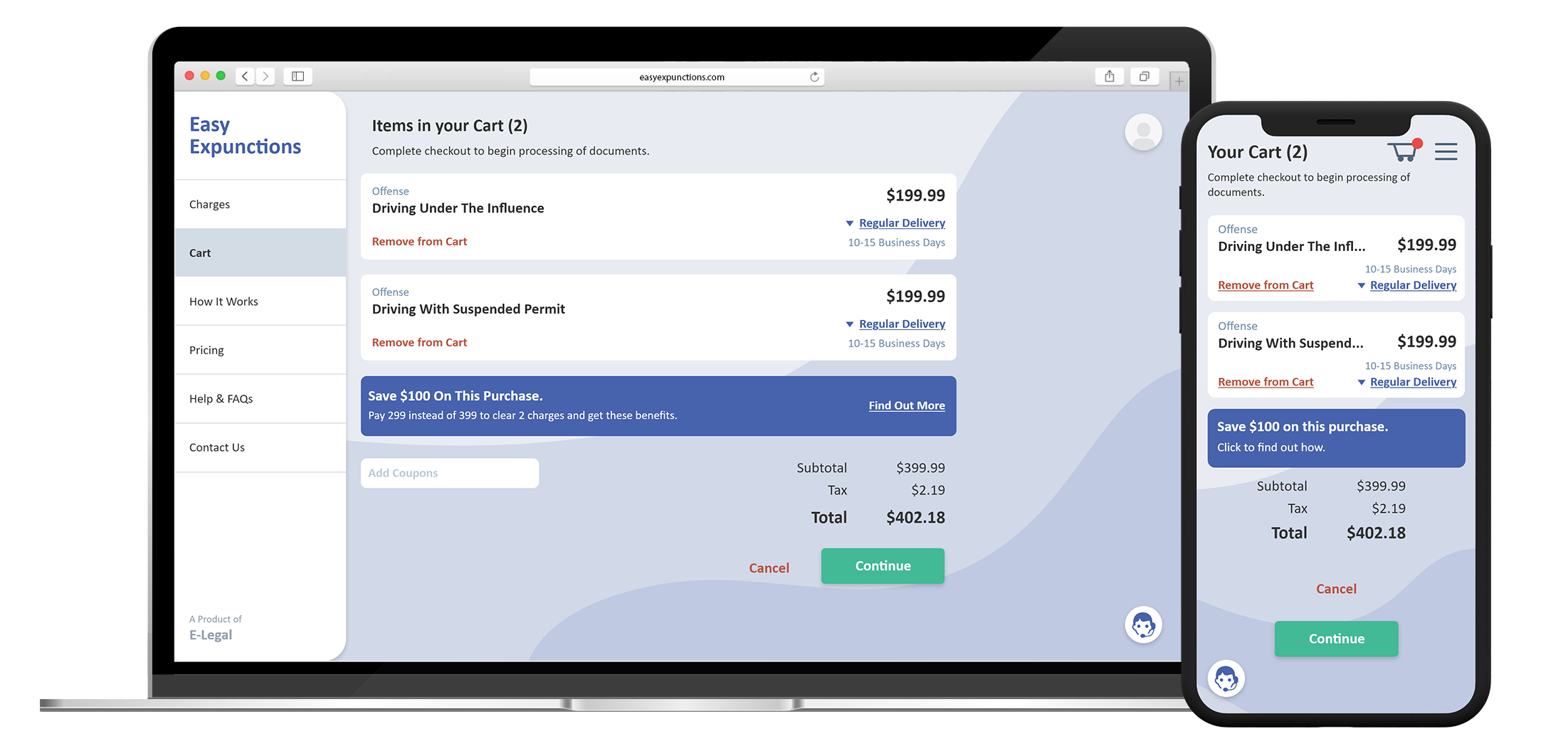
User Interface mockup for Records Dashboard.

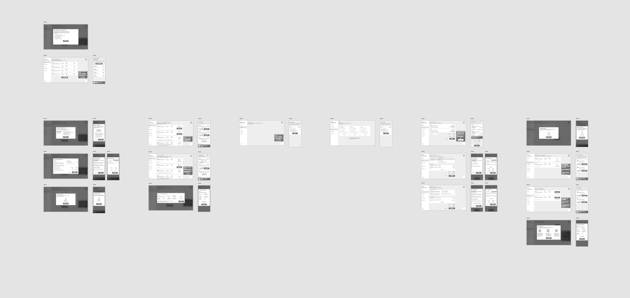
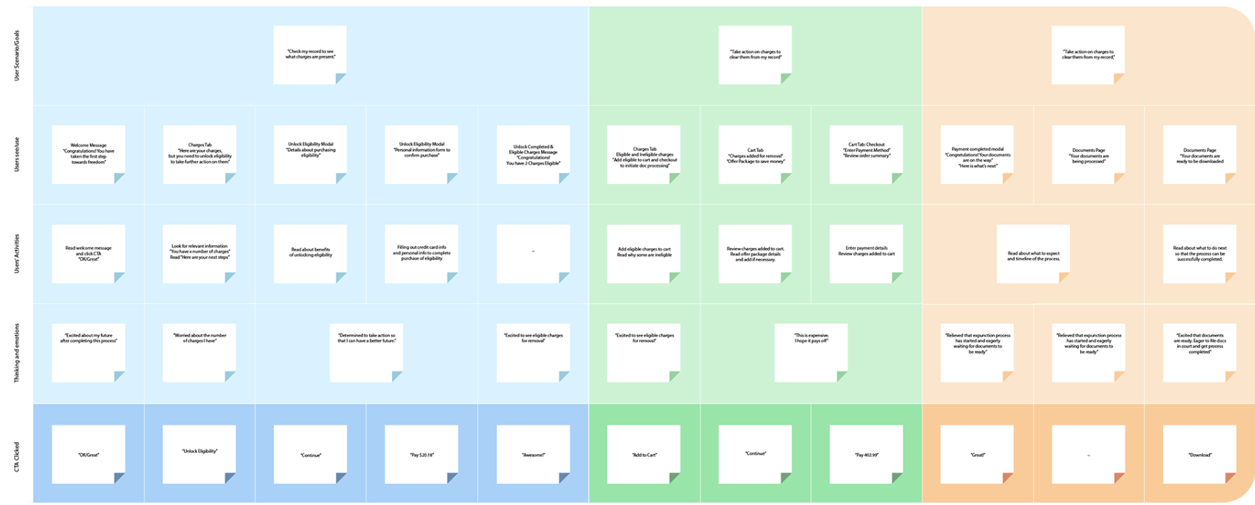
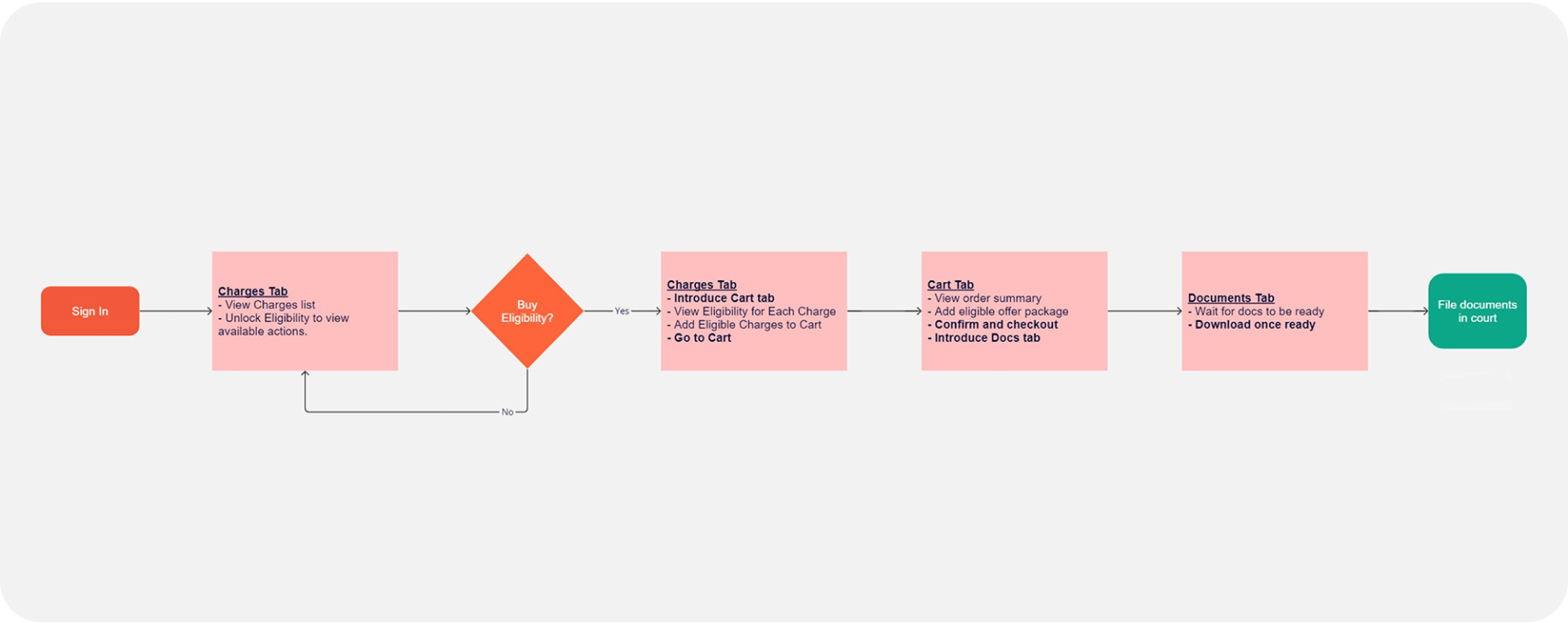
Deliverables for Records Dashboard.

Page Dog Ear

Project Manager's Testimonial

"I had the pleasure of working with Amith for about 1.5 years. As a UI/UX developer on my team, he consistently demonstrated a strong-eye for detail and a calculated approach to his designs, thoroughly investigating the audience’s behaviors before creating aesthetically pleasing and intuitive interfaces. For example, during the company’s effort to overhaul the web-platform, Amith conducted multiple focus group sessions and even created all the materials used to facilitate data collection. He then analyzed the data to create a new user experience that significantly improved monthly registrations and purchases on our site.

Amith stays abreast of emerging trends and tools in the design industry and actively seeks to improve his skillset. Moreover, Amith is very easy to work with—in disagreements, he patiently and logically explains the rationale behind his design selection and listens intently to feedback by team members."

Haroon Badat

Page Dog Ear
Page Dog Ear