Developing Stride's
First MVP

Stride is an iPad OS application designed to help gas station owners dish out irresistible deals to customers to keep them coming back.

To stay concise here, below are some key highlights from the project. If you would like to discuss this project in detail, kindly reach out to me.
...
Page Dog Ear

Situation

At Stride, business constraints shaped our initial release. The first MVP (Minimum Viable Product) included only the app for gas station owners. The truck driver’s side of the app was put on hold for the moment.

Target Users

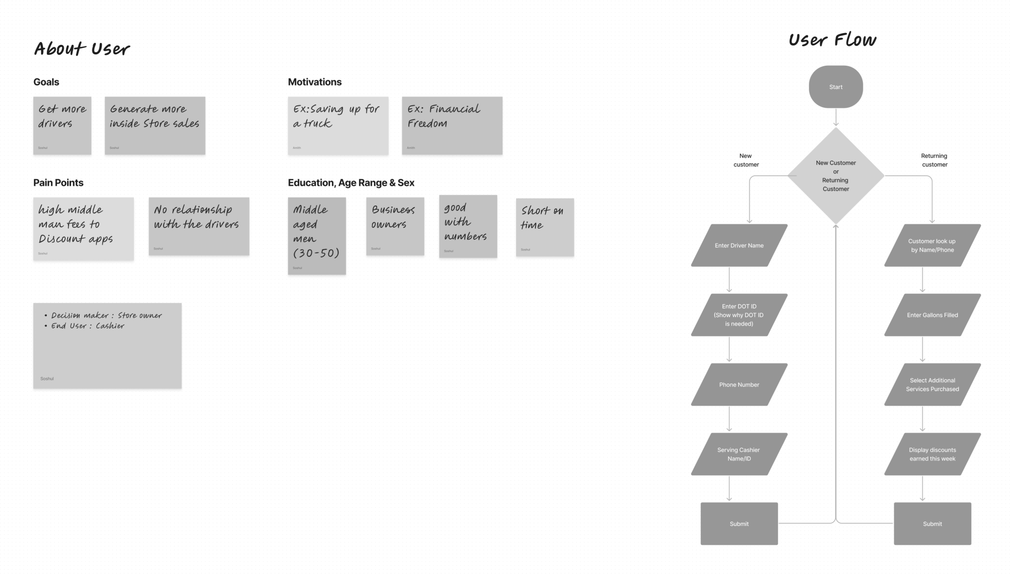
The target users being focused on at the moment are only cashiers. Since they varied in age and exposure to technology, the application needs to be simple to use.

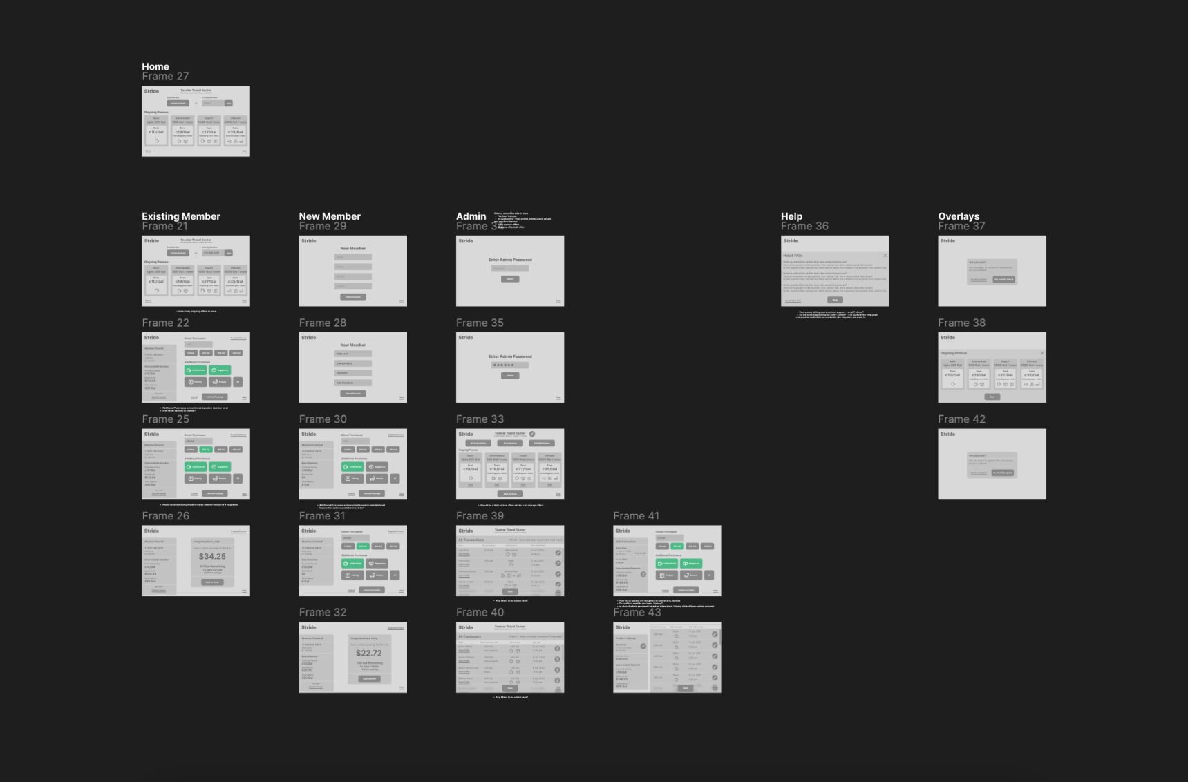
User Persona, Flowchart for Stride.

Functionality

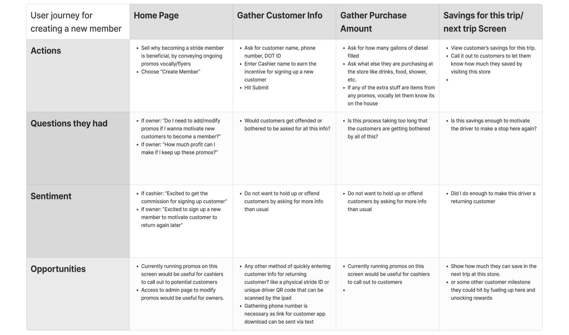
The application needs to keep track of customers and their purchases on every visit. Every time the customer checks in with the cashier, customers would get to know their savings on their purchase for that trip.

User Journey for Stride.

Page Dog Ear

Task

Through research, feedback from users, and collaborating with stakeholders, the major tasks were boiled down to what's below:

Priority #1

Purchase Data Collection

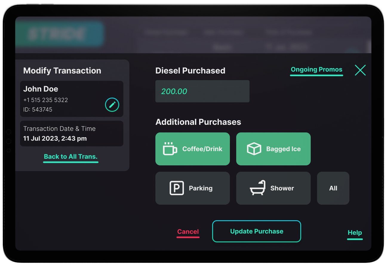
Cashiers needed to be able to quickly gather and input information about the customers' purchase to calculate final cost and savings.

Priority #2

Visual Communication of Savings

Customer's savings on this visit, and previous visits needed to be communicated to the cashier to help motivate the customer to come again.

Priority #3

Clean Experience Design

As with any project, the overall user experience which includes interface design needed to be clean, and unobtrusive to enable users' goal completion.

Page Dog Ear

Results Achieved

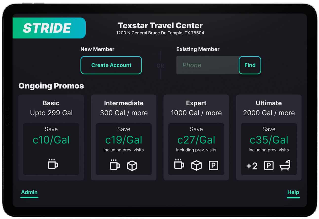
Highlight Ongoing Offers

Ongoing offers were highlighted on the home page to remind cashiers of the different tiers of savings available currently. This way cashiers can communicate them to customers easily.

Highlight Customer Savings

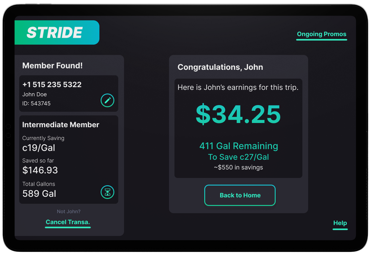
The savings accrued by the customer is calculated and presented to the cashier at the end of the flow. This information can be passed onto the customer to help motivate another visit from the customer.

Improved Usability and Readability

The application will be used mostly by cashiers on a touch screen device at cash registers near windows and other sources of light. So a dark theme is used to design the interface, and this makes it more user friendly for the cashiers.

User Interface mockups for Stride.

Page Dog Ear
Page Dog Ear